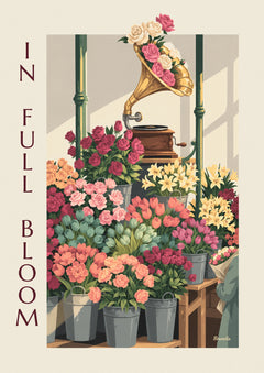
A poster can echo the colors of your interior or introduce a contrast. You don’t need to fit the whole room into a single style to find a combination you love.
1Look around before choosing a label
Look at the dominant colors, the materials and how much space objects already take up. A very detailed room can handle a simple image, while a clear wall can leave room for a more striking composition. These are ideas to compare, not strict rules.
2Explore several directions
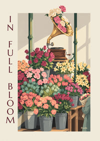
- Botanical: botanical posters let you compare leaves, flowers and natural palettes.
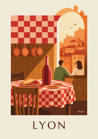
- Travel memories: city views connect your decor to a place you love.
- Everyday life: kitchen posters offer subjects around the table, drinks and bistro scenes.
- A passion: choose a subject from the catalog that you’ll want to look at for a long time, then compare its palette with your room.
3Mix without piling on constraints
To bring 2 different posters together, look for a common thread: a color, a subject or the style of the frames. You can also embrace contrast. Compare the images side by side before deciding; a clean, minimalist interior doesn’t rule out a pair, and bold colors aren’t reserved for one particular style.
4From image to wall
Measure the spot and the footprint of the frames. The spaces between posters are part of the arrangement. Try out paper templates on the wall and look at them from your usual spots in the room.
The living room guide helps you plan an arrangement, and the framing guide details the dimension checks to make before you buy.